The Living Landmark
Concept
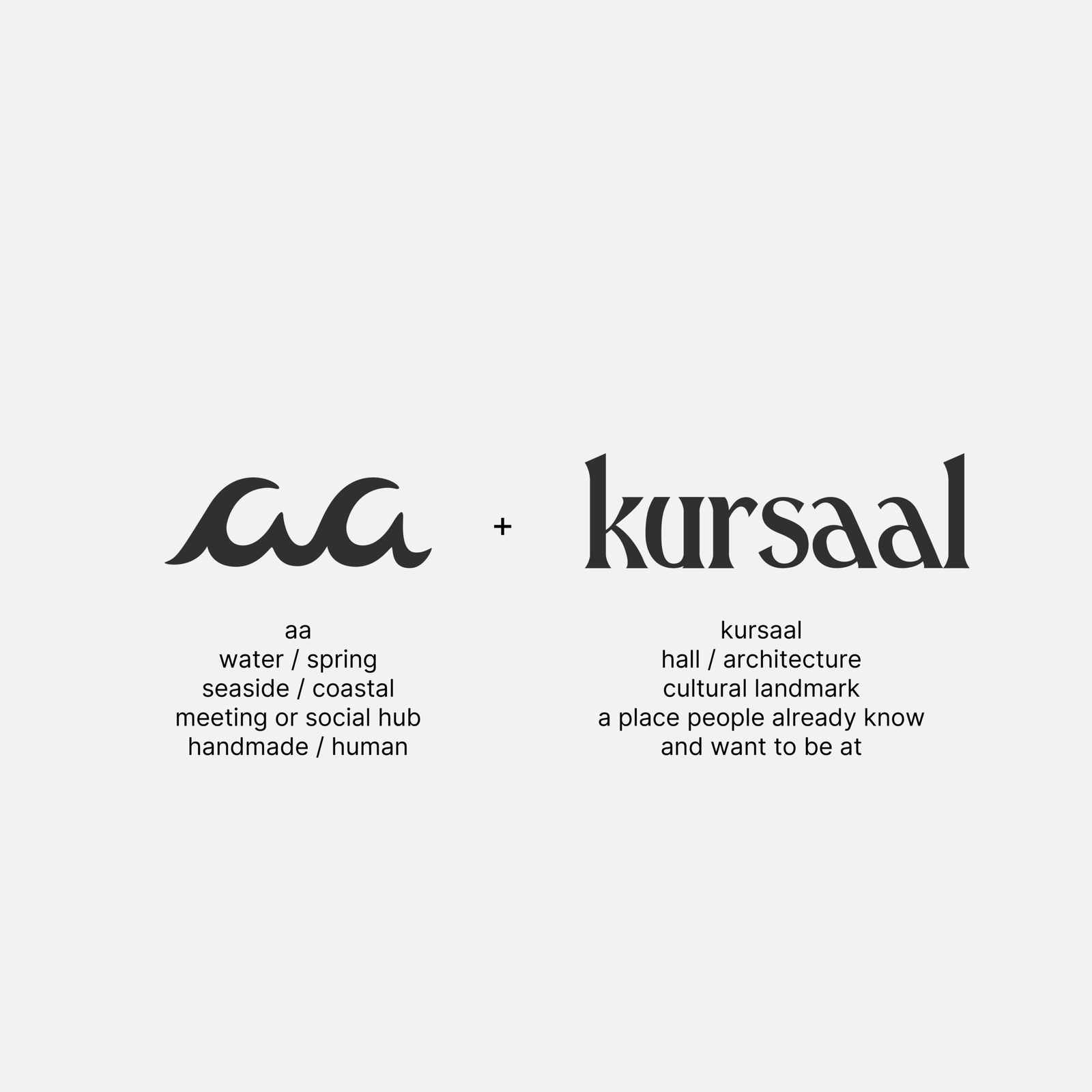
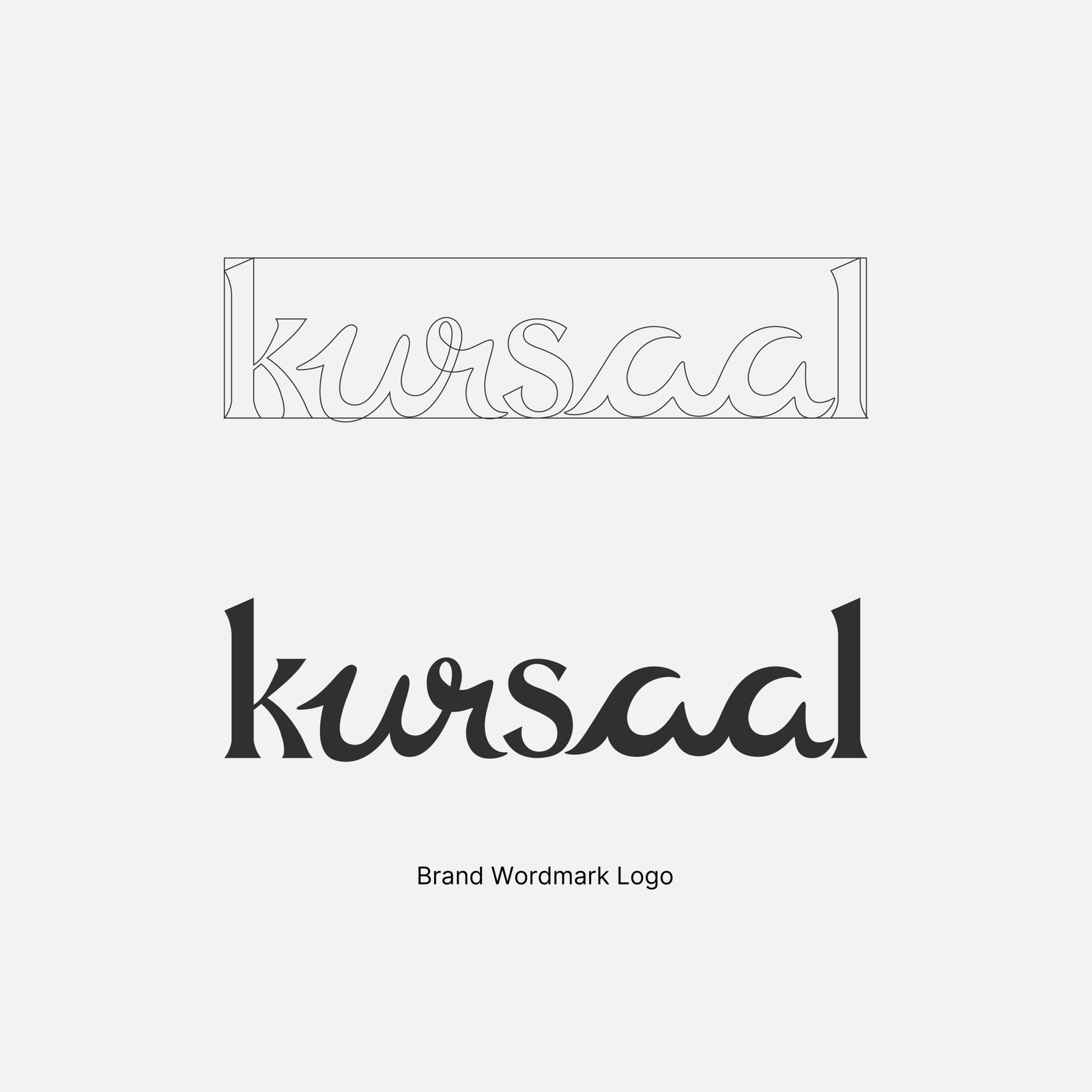
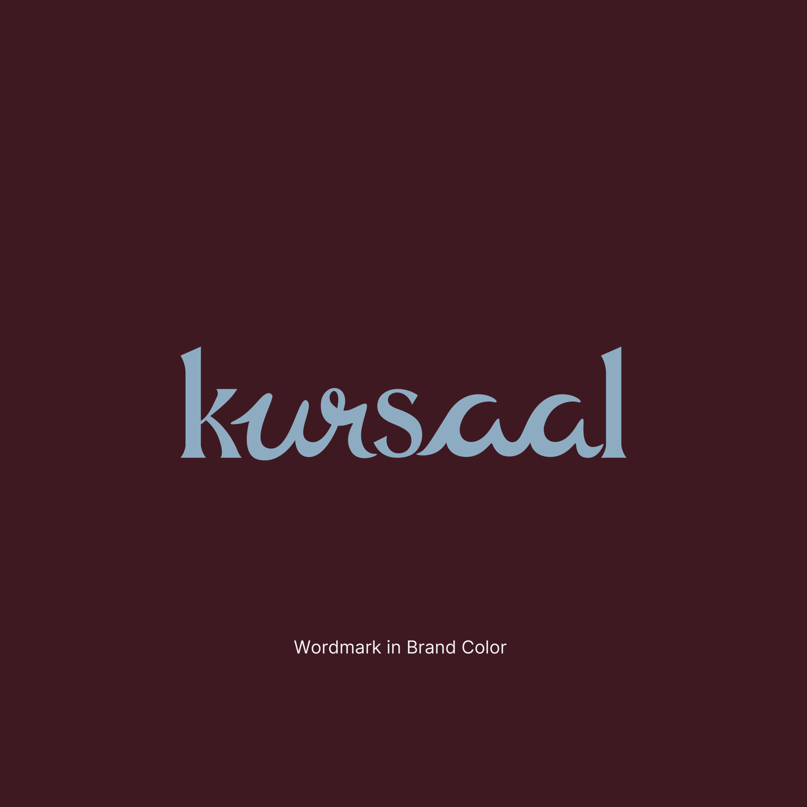
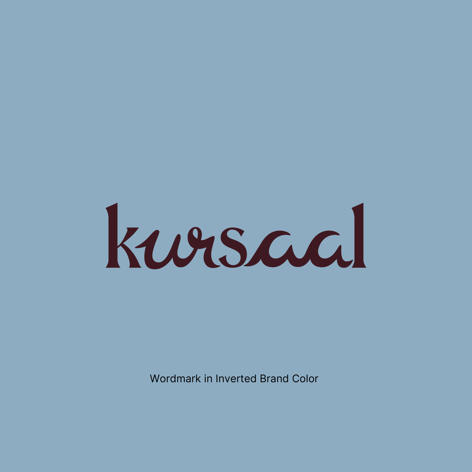
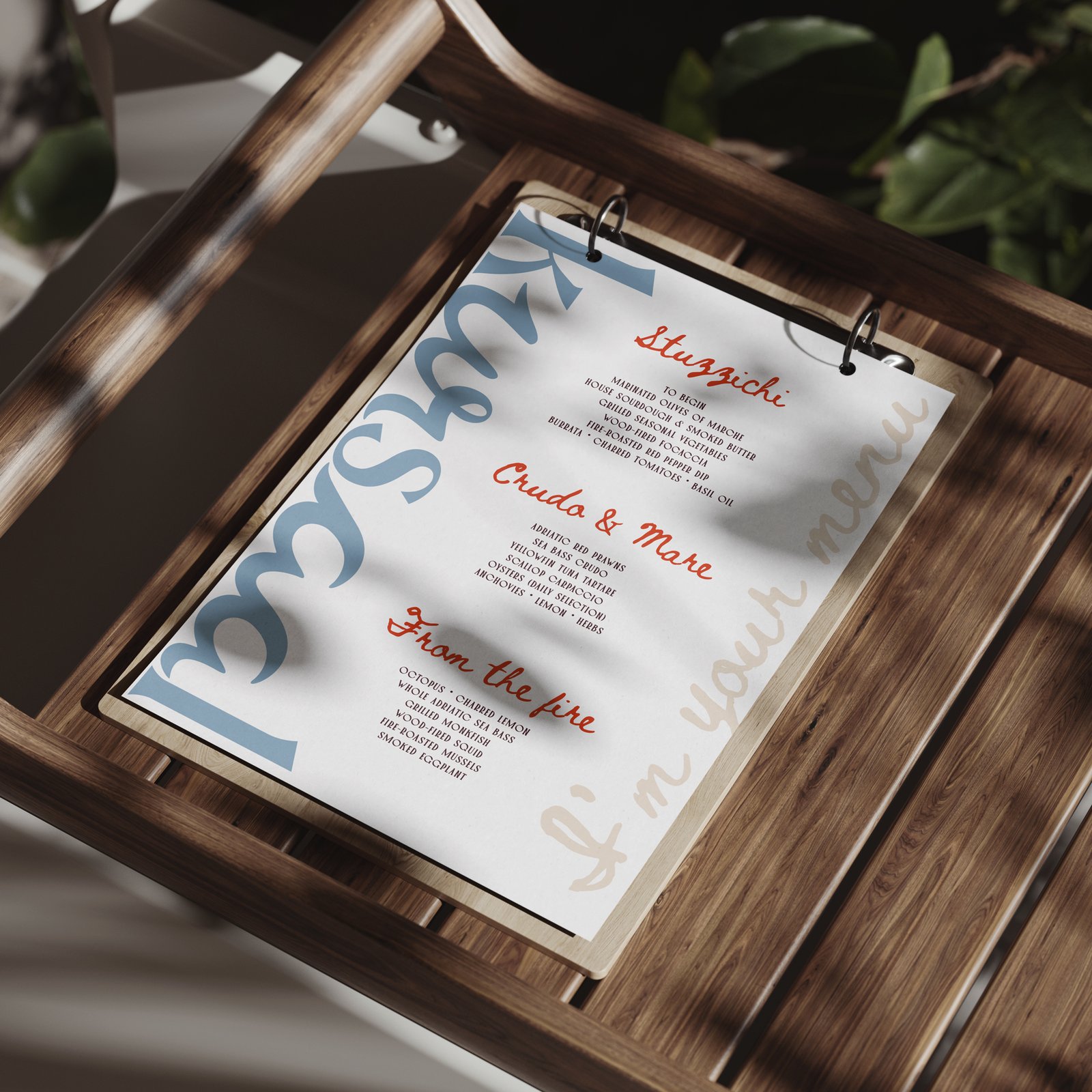
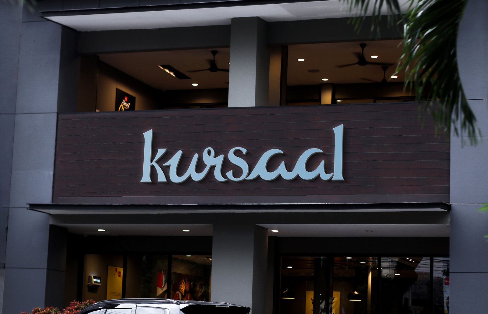
For over a century, Palazzo Kursaal has stood as one of Grottammare's most recognisable landmarks. While the building has witnessed generations of change, its purpose has always remained the same—to bring people together.Andrea's vision is not to reinvent Kursaal, but to continue its legacy. His ambition is to transform the restaurant into the town's true social heart, creating a place where guests feel welcomed, connected, and leave with memories that last far beyond the meal itself. Success is not measured simply by exceptional food, but by hearing someone say, "I had such a great evening."This concept translates that philosophy directly into the wordmark.The typography is divided into two complementary personalities, reflecting the historical meaning of the name Kursaal. The k, s, and l are inspired by the architectural language of the Palazzo itself, built using the proportions and timeless elegance of Palmore. These structured letterforms symbolise the permanence of the historic hall—the building that has served as Grottammare's gathering place for generations.
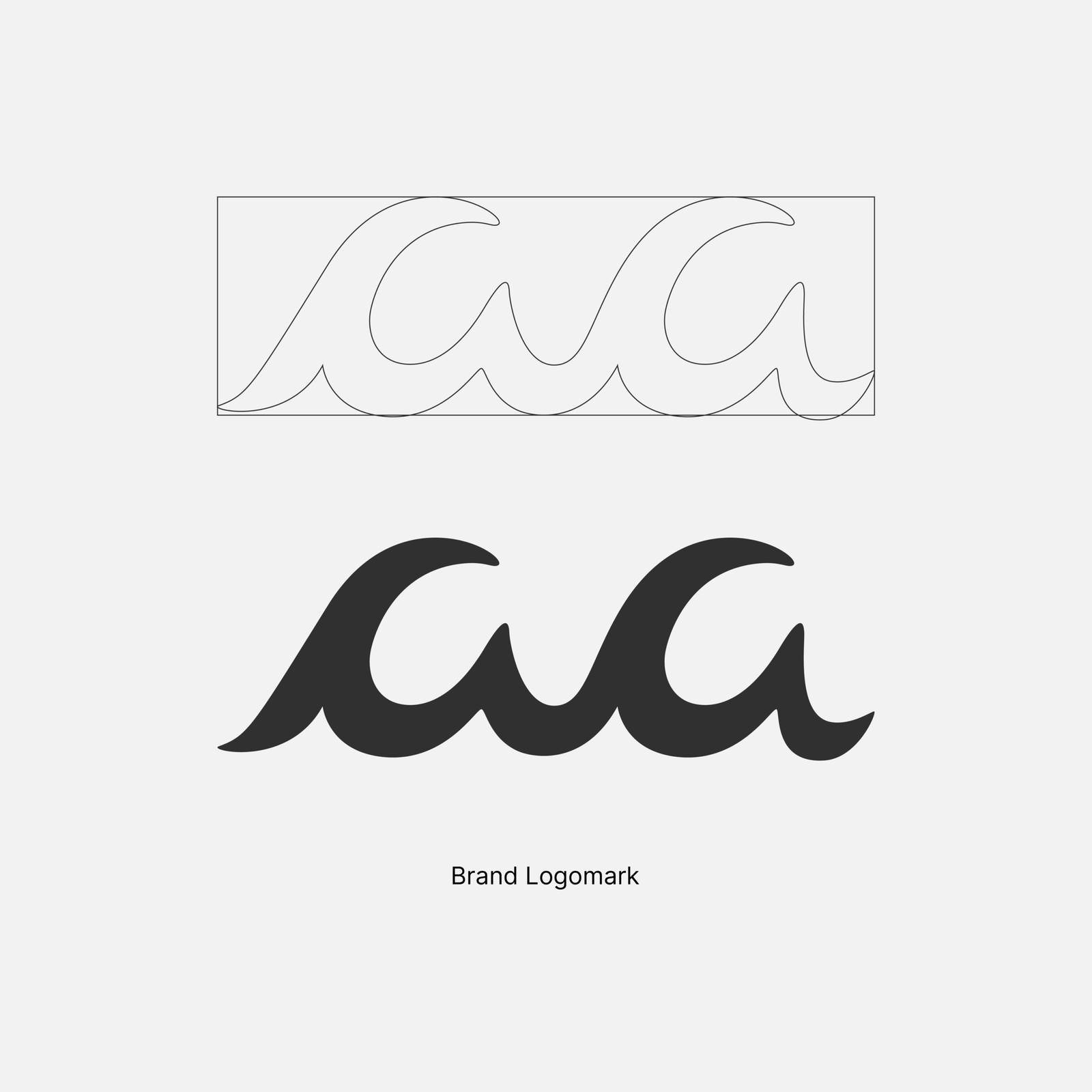
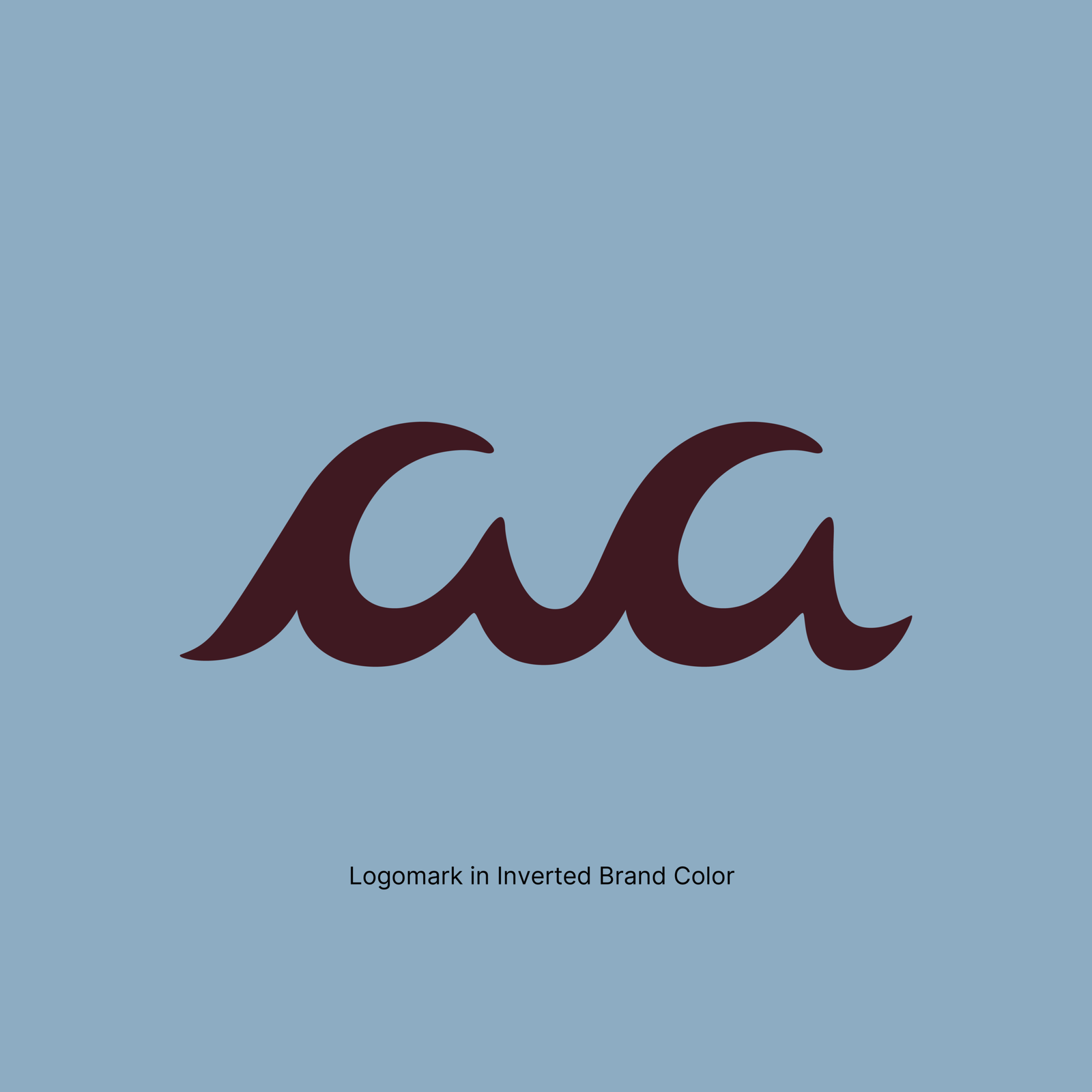
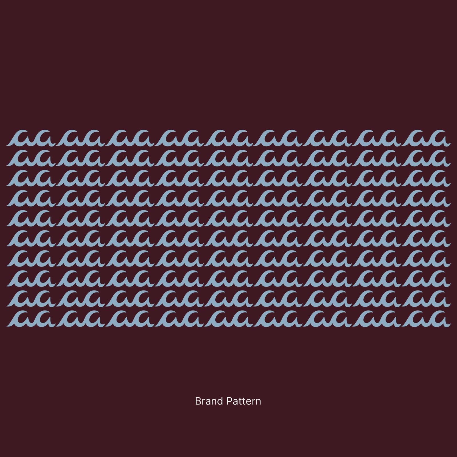
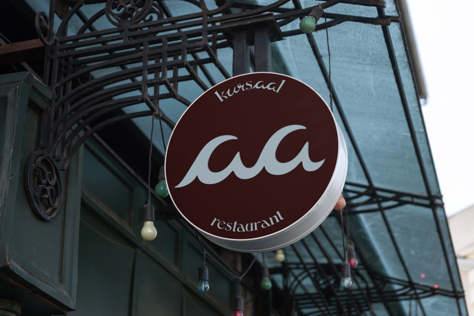
In contrast, the custom hand-crafted 'aa' introduces movement and humanity. Drawn with a flowing script-inspired gesture, the two letters subtly echo the rhythm of the Adriatic Sea. Hidden within the typography is the idea of water—not as a literal wave, but as a quiet reminder of the coastline that has shaped Grottammare's identity and the original spirit of Kur: restoration, wellbeing, and shared moments.Rather than illustrating the sea, the wordmark allows it to exist naturally within the name itself. The living movement of the 'aa' sits inside the architectural stability of Saal, symbolising how today's Kursaal continues to offer restoration—not through spa culture, but through hospitality, conversation, music, food, art, and meaningful human connection.
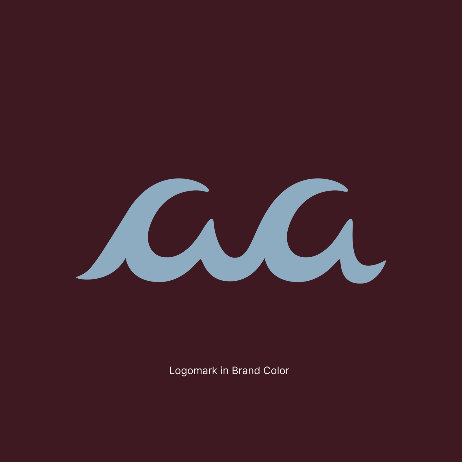
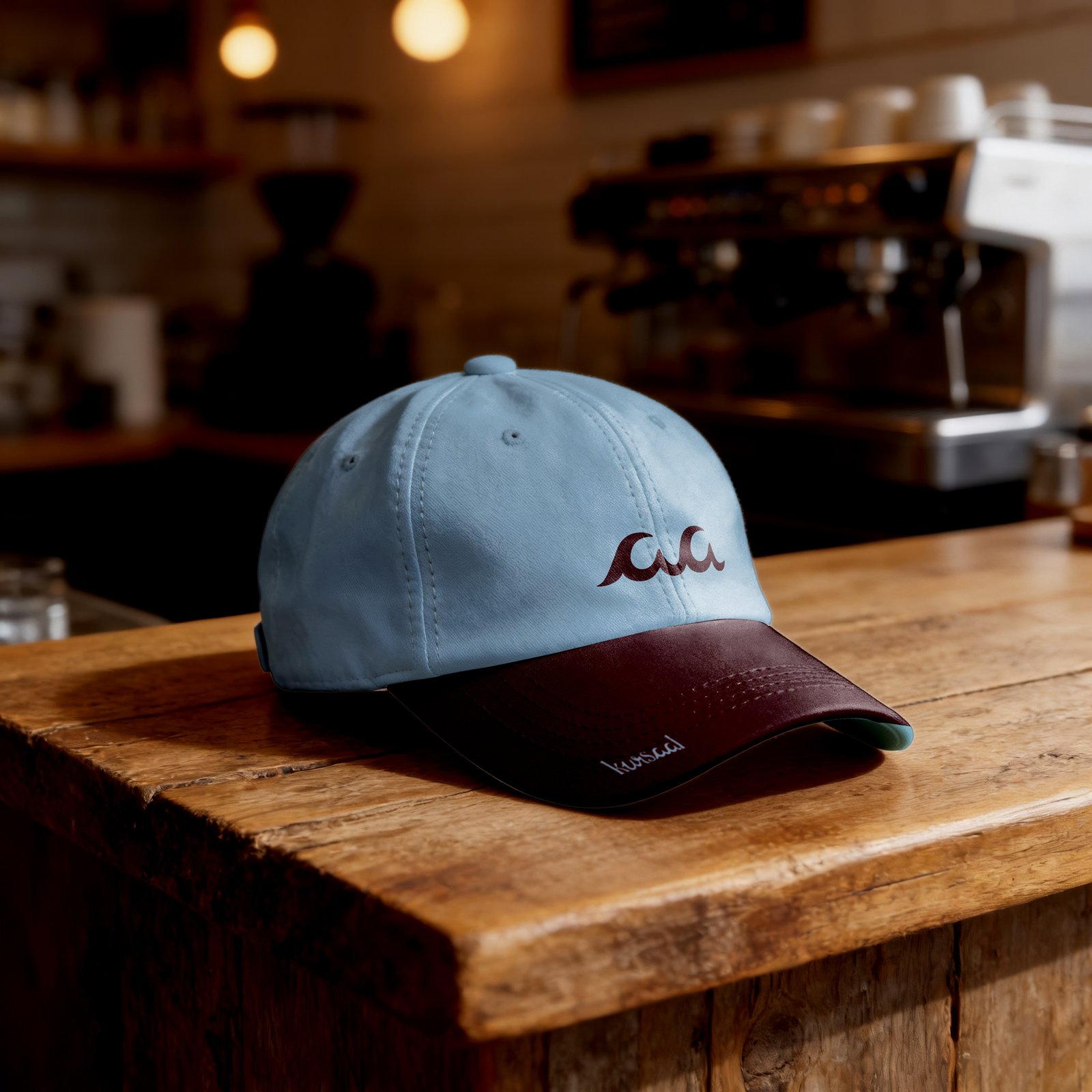
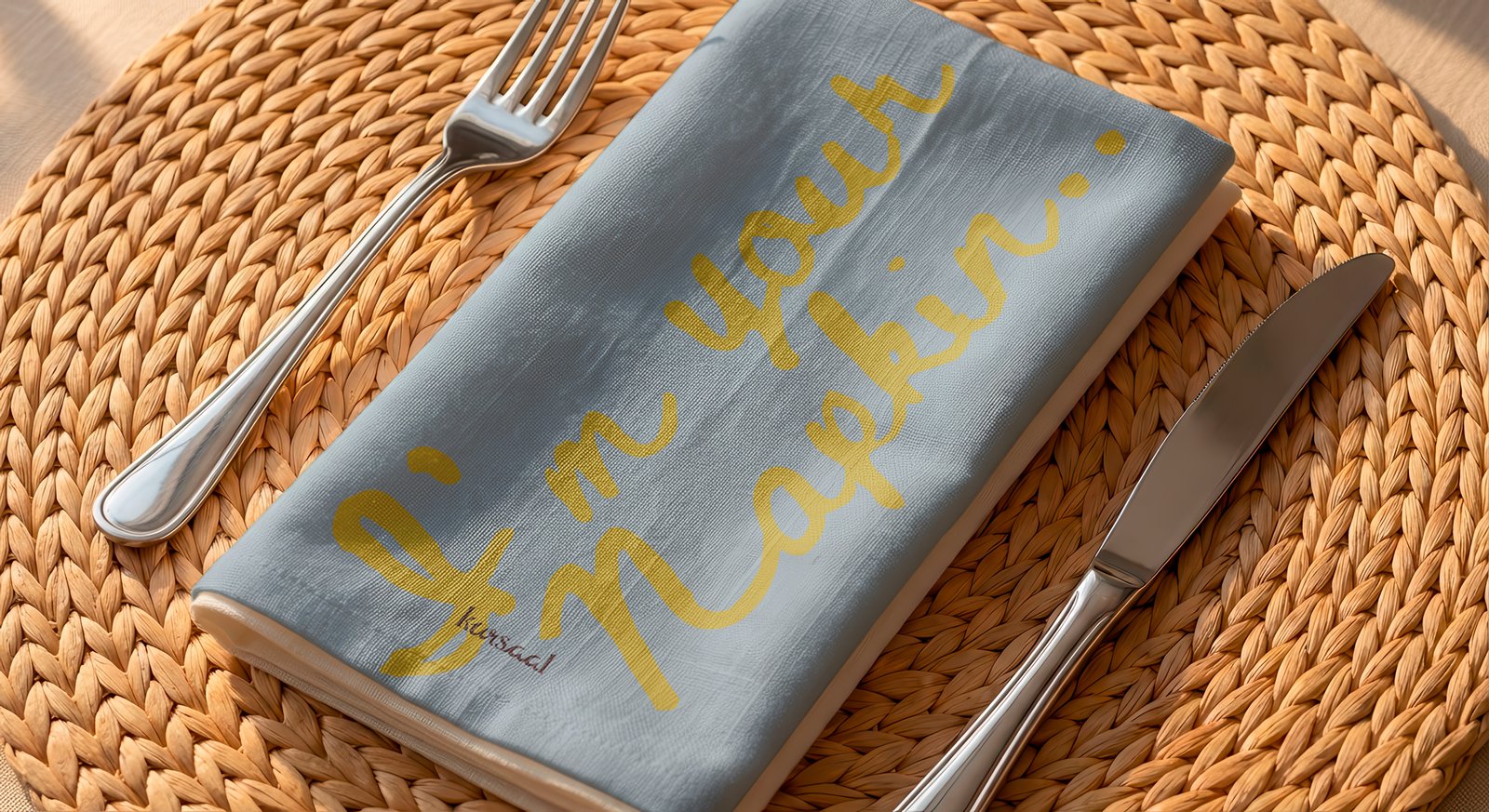
The chosen colour palette further reinforces this narrative. Breeze (#8DACC2) reflects the Adriatic coastline and the fresh sea air that has defined Kursaal since its earliest days. Calm, understated, and contemporary, it symbolises the building's continuous role as Grottammare's seaside social hub—from its historic origins to Andrea's renewed vision for the future.Supporting it is Charred Wood (#3F1921), a deep, earthy tone inspired by timber after the flames have faded. It evokes the warmth of live-fire cooking, charcoal, aged wood, fine wine, and the honest natural materials that shape the restaurant's atmosphere. Rather than representing fire itself, it captures what remains afterwards: warmth, comfort, memory, and time shared around the table.Together, these elements create a timeless identity that does not rely on trends or decorative symbolism. Instead, the wordmark becomes a quiet expression of Palazzo Kursaal's enduring legacy—where architecture meets humanity, the Adriatic meets hospitality, and history continues to gather people together for generations to come.